In the age of information overload, visual aids like comparison infographics have become invaluable tools for conveying complex data in a digestible format. However, not all infographics, especially those lacking a well-structured comparison infographic template, are created equal. This article delves into the common design pitfalls one should avoid to ensure their comparison infographics effectively communicate the intended message.
Importance of Comparison Infographics
Comparison infographics offer a quick and easy way to showcase differences and similarities between multiple data sets. They simplify complex information, making it more accessible to a wider audience. Whether you're presenting market trends, product features, or statistical data, a well-designed comparison infographic can significantly enhance comprehension and engagement.
Common Mistakes in Comparison Infographic Templates
1. Lack of Clarity
One of the primary mistakes in comparison infographics is a lack of clarity. If the information is not presented in a straightforward manner, the audience may struggle to understand the intended message. Avoid clutter and ensure that each element serves a purpose in conveying the information.
2. Overcrowded Information
Infographics should be visually appealing, but overcrowding them with excessive data can be counterproductive. It's crucial to strike a balance between providing enough information and maintaining a clean, organized layout.
3. Inconsistent Design Elements
Consistency is key in design. Using a mishmash of fonts, colors, and styles can confuse the audience and diminish the infographic's overall impact. Stick to a cohesive design scheme to maintain professionalism and readability.
4. Poor Color Choices
Colors evoke emotions and play a crucial role in information retention. Poor color choices can lead to misinterpretation or disinterest. Choose a color palette that aligns with the topic and ensures readability for a harmonious visual experience.
Best Practices for Effective Comparison Infographics
1. Clear Titles and Labels
Ensure that each section of the infographic is well-titled and adequately labeled. This not only guides the reader but also adds to the overall clarity of the information presented.
2. Consistent Layout
Maintain a consistent layout throughout the infographic, utilizing standardized elements and spacing. Consistency enhances readability and guides the viewer's eyes smoothly from one section to another, making it essential when working with infographic templates. By incorporating a cohesive design approach, your audience can navigate the information seamlessly, fostering a better understanding of the content presented.
3. Limited Data Points
While it's tempting to include all available data, limiting the number of data points prevents overcrowding and ensures that the viewer can absorb the information without feeling overwhelmed.
4. Thoughtful Use of Colors
Choose a color scheme that complements the subject matter and aids in conveying the intended message. Thoughtful color use enhances aesthetics and improves information retention.
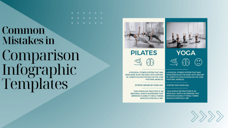
Examples of Well-Designed Comparison Infographics
To understand the principles of effective design, let's explore a few examples of well-crafted comparison infographics:
Tools for Creating Infographics
Creating stunning infographics is easier than ever with the help of various online tools. Some popular choices include Canva, Piktochart, and Venngage. Experiment with these tools to find the one that best suits your design preferences and requirements.
User-Friendly Design Tips
For those without a design background, creating infographics might seem daunting. However, with these user-friendly design tips, anyone can produce visually appealing and informative comparison infographics:
Keep It Simple
Start with a straightforward design and gradually add elements as needed.
Use Templates
Many online tools offer pre-designed templates that can serve as a foundation for your infographic.
Seek Feedback
Share your draft with colleagues or friends to gather valuable insights and improve the design.
Importance of Mobile Responsiveness
Given the prevalence of mobile devices, it's essential to ensure that your comparison infographics are mobile-friendly. Responsive design guarantees that your visuals look as impressive on a small screen as they do on a desktop.
Balancing Text and Visuals
Effective comparison infographics strike a balance between text and visuals. While visuals simplify complex information, the accompanying text provides context and enhances understanding. Find the right equilibrium to create a compelling infographic.
Testing and Iteration
Don't hesitate to test your infographics on a sample audience. Analyze their feedback and be open to making iterative improvements. Continuous testing ensures that your visuals resonate with your target audience.
Case Studies: Success Stories
Explore real-world success stories where businesses or individuals achieved their communication goals through well-designed comparison infographics. Case studies provide valuable insights and inspiration for your own projects.
Design Trends in Comparison Infographics
Stay abreast of the latest design trends in comparison infographics. Whether it's the use of innovative layouts, interactive elements, or unique data visualization techniques, incorporating current trends can make your infographics stand out.
Common Misconceptions
Addressing common misconceptions about comparison infographics helps dispel myths and allows creators to make informed design choices. Clarify aspects like the necessity of simplicity, the importance of data accuracy, and the impact of design on viewer perception.
Tips for Non-Designers
Even if you don't consider yourself a designer, you can still create compelling infographics. Follow these tips:
-
Utilize user-friendly design tools.
-
Keep your design simple and focused.
-
Pay attention to color choices for better visual appeal.
Conclusion
In summary, steering clear of design pitfalls is essential when aiming to craft compelling and effective comparison infographics. Through the application of best practices, the utilization of PhotoADKing's user-friendly infographic maker tools, and staying abreast of design trends, individuals can generate visually striking and informative infographics that engage and captivate their audience.